The Marble Table #003: The Quiet Power of Colour & Composition.
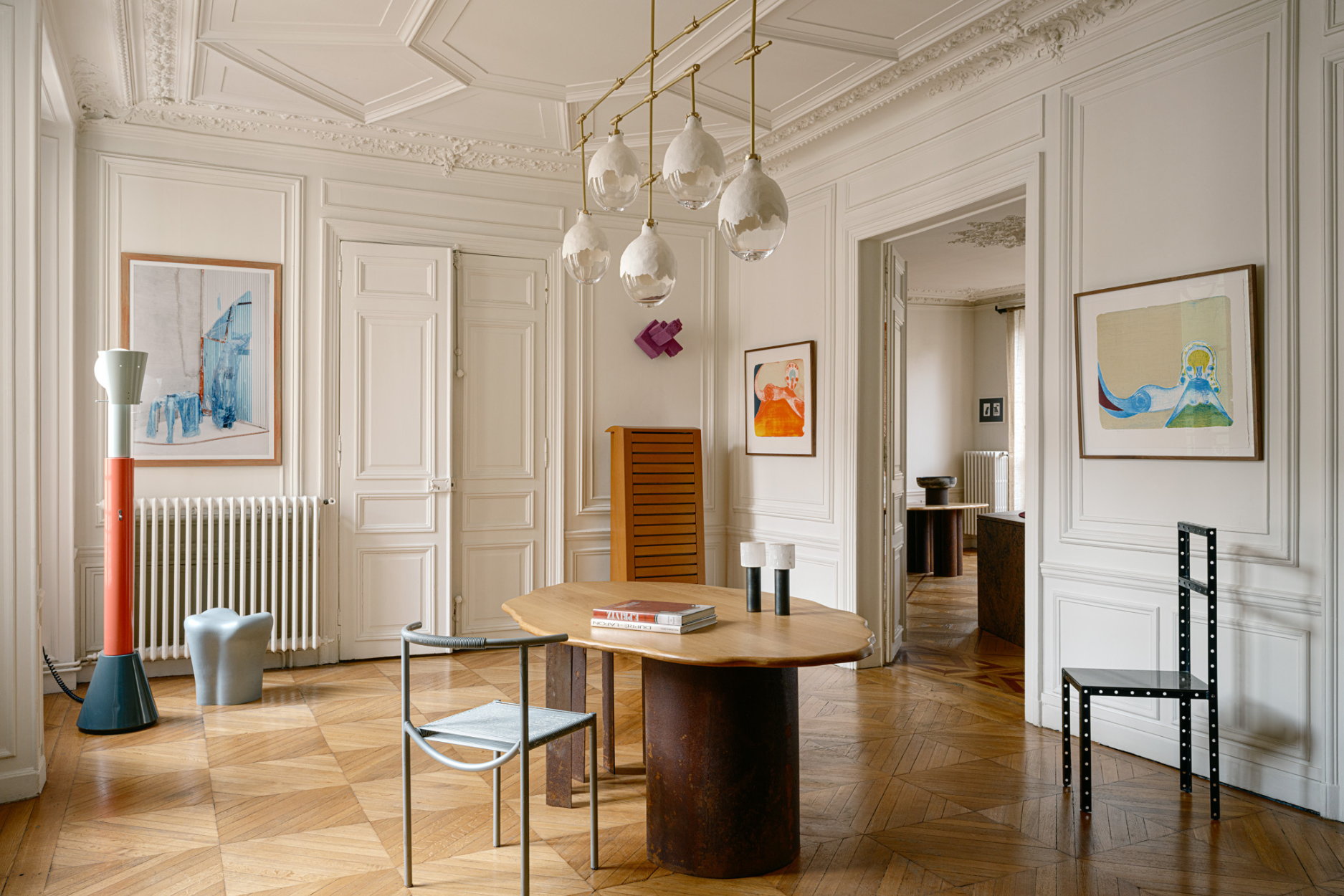
There is a common misconception that restraint is synonymous with neutrality. That a pared-back home should exist only in shades of white, beige and stone. Yet the most memorable interiors prove the opposite. They embrace colour not as decoration, but as atmosphere. They understand that a single saturated wall, a glazed ceramic vessel or a richly pigmented tile can create a rich sensory experience.
The spaces I return to most are those that balance confidence with calm. Interiors that are thoughtfully composed rather than meticulously styled. Rooms that reveal themselves slowly through texture, material and colour, where every object feels intentional, and every surface contributes to a wider conversation.
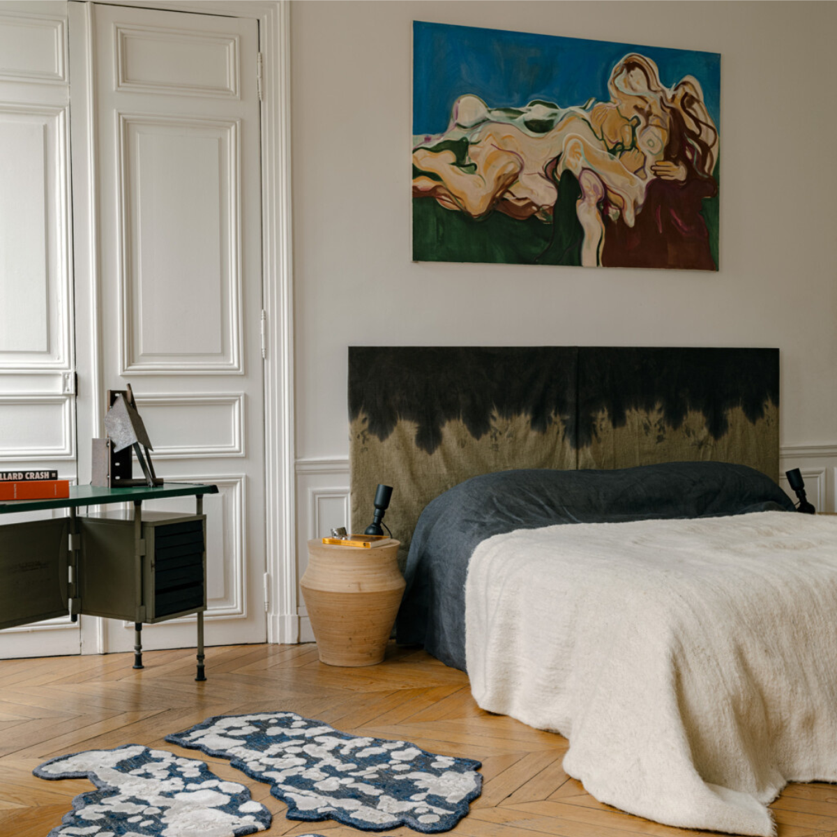
This is why I find myself continually drawn to the worlds of Tonester, Palet and Sophie Dries. While each approaches design through a different discipline, together they form a visual language rooted in materiality, emotion and timelessness.
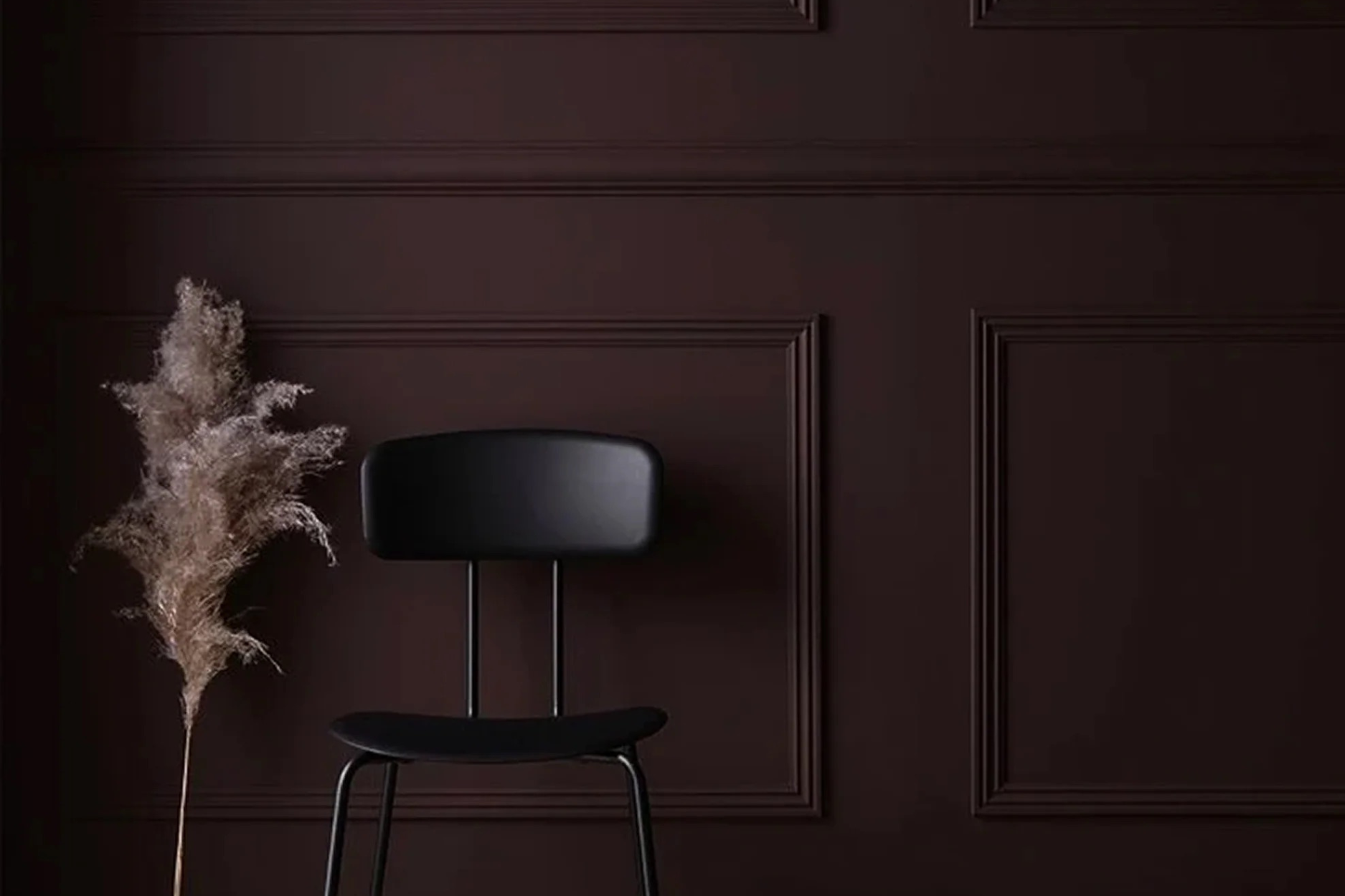
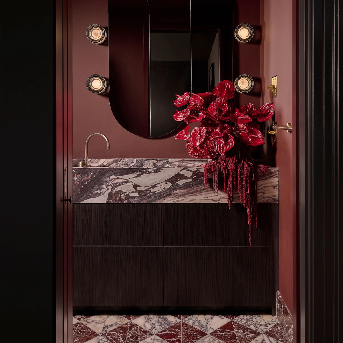
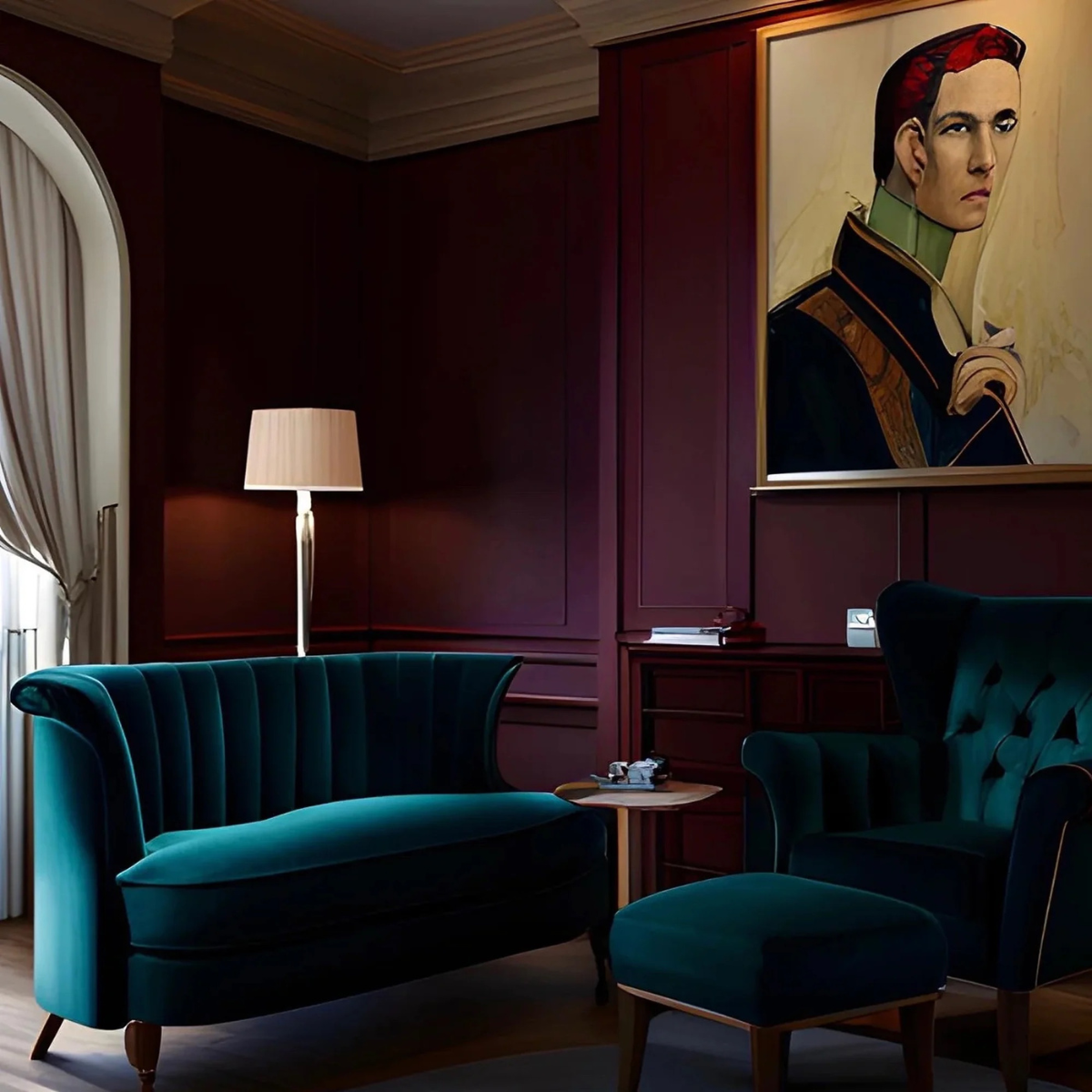
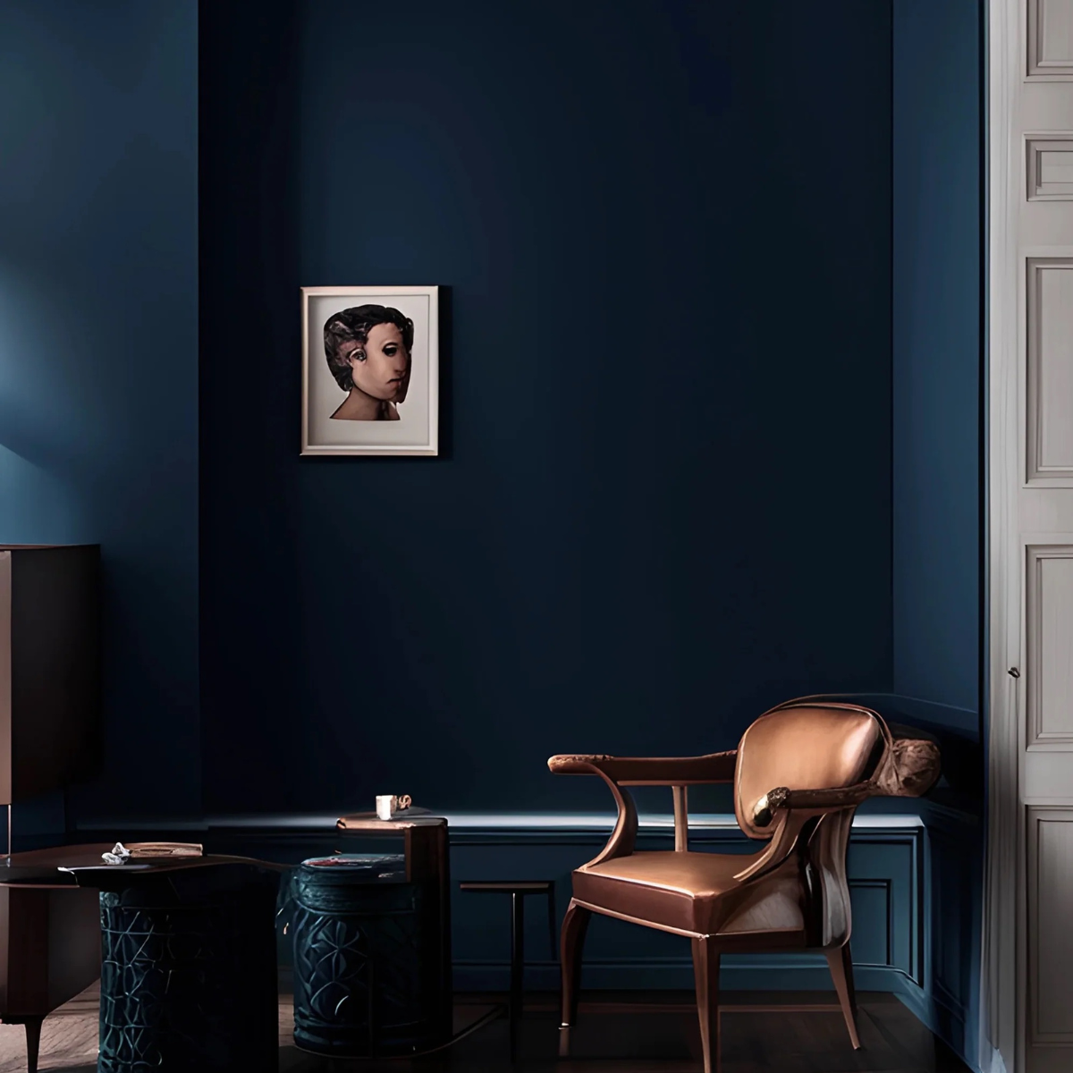
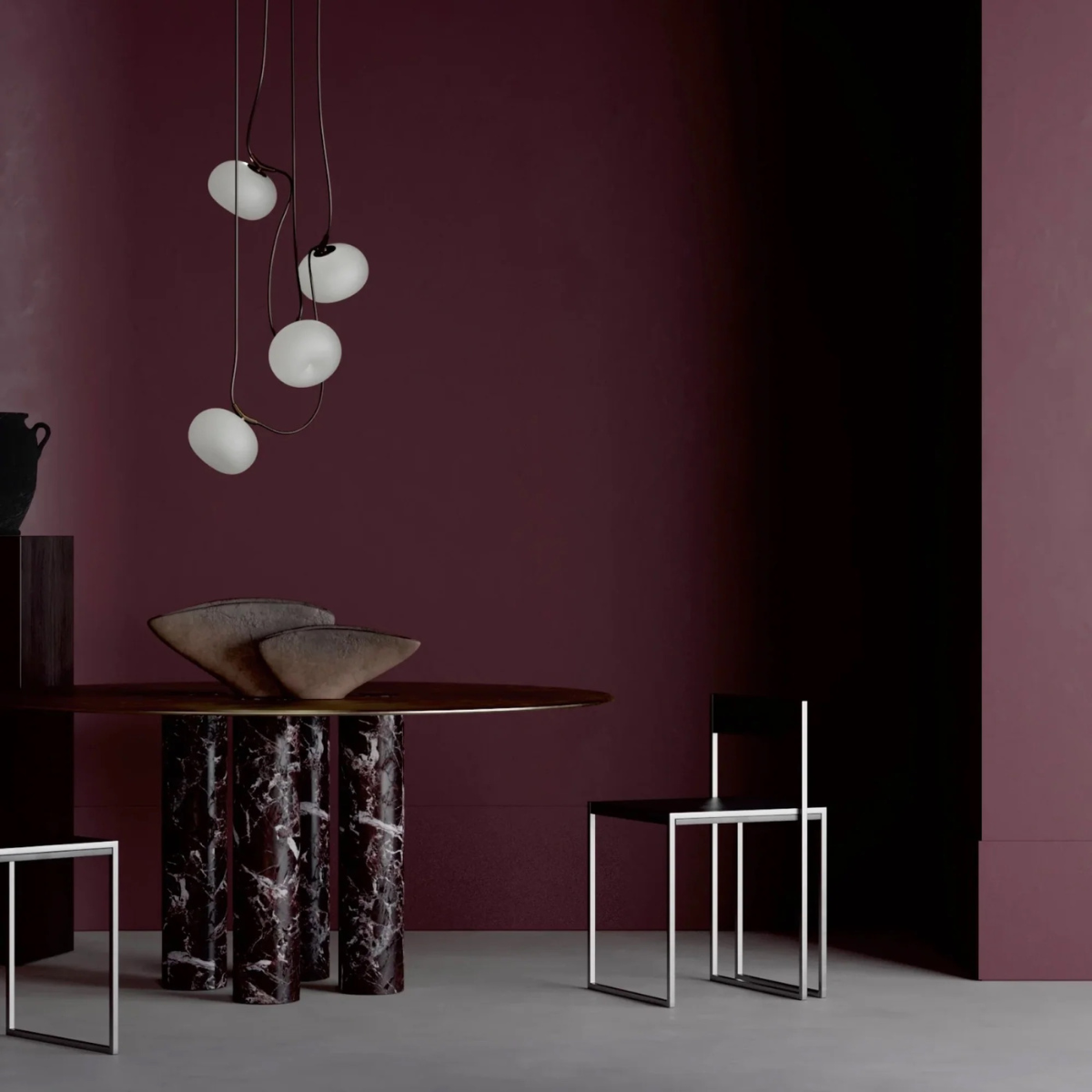
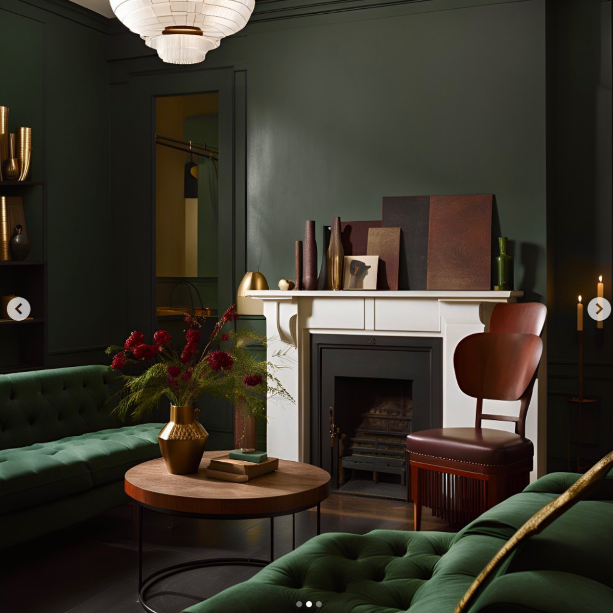
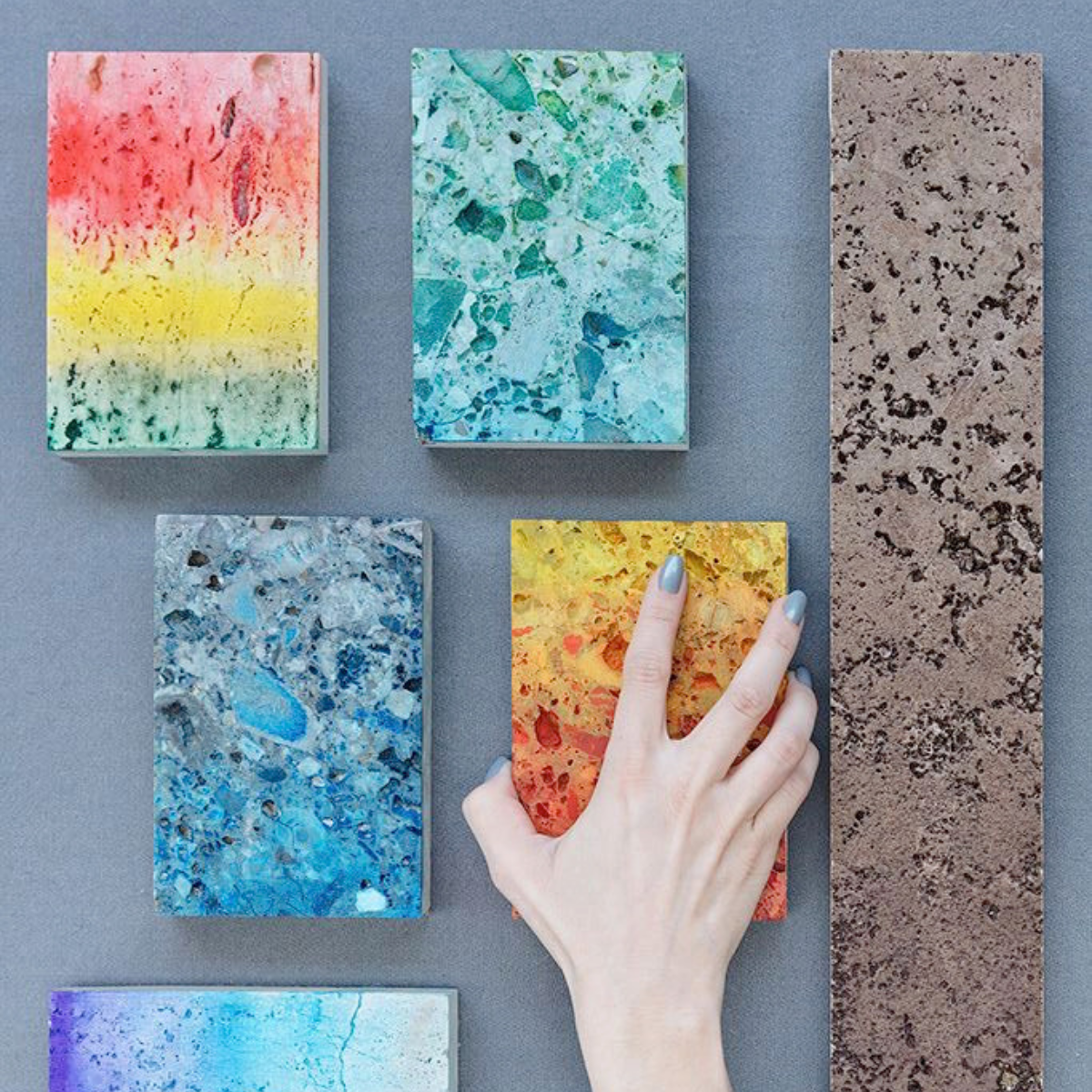
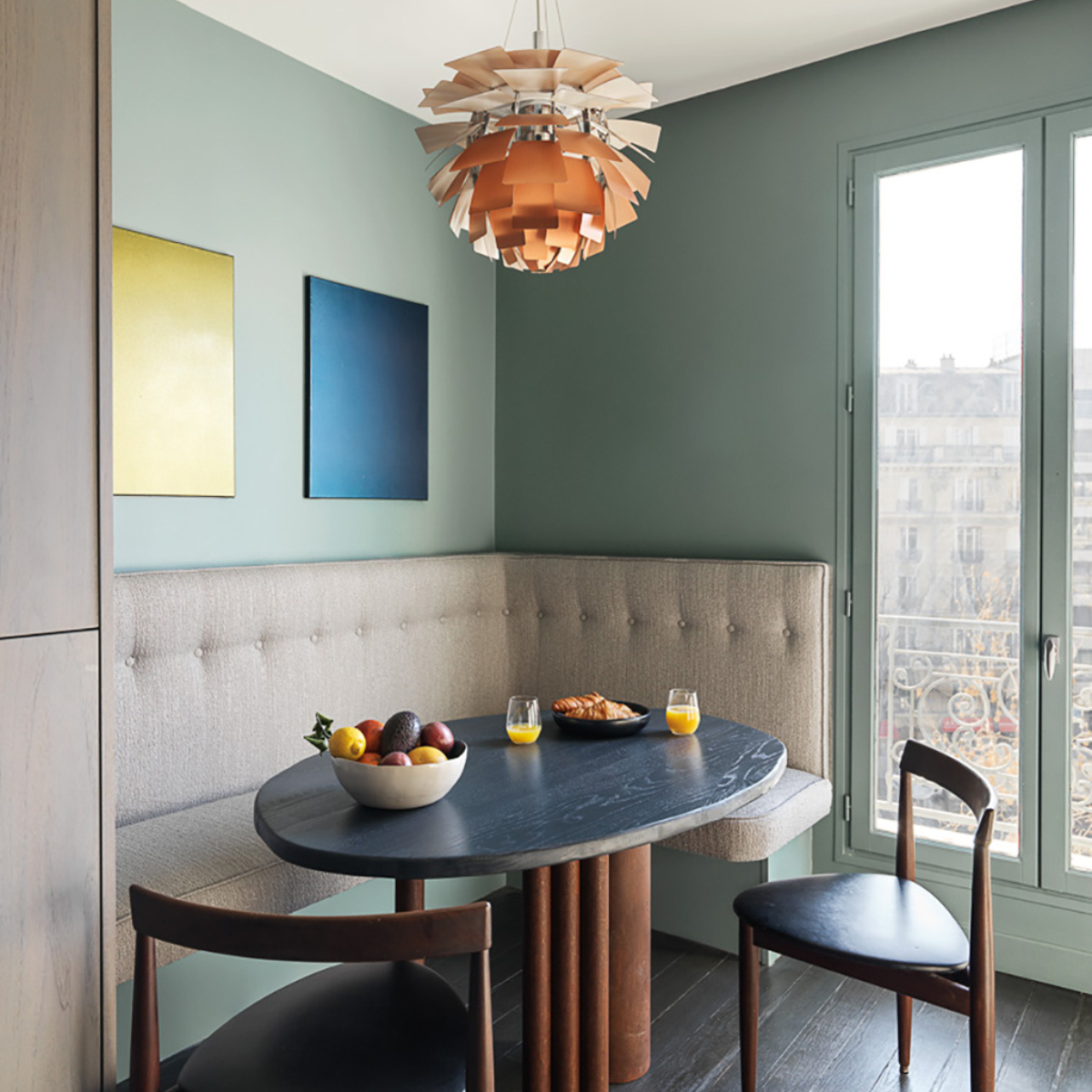
Tonester approaches colour with an almost cinematic sensibility. Its designer pigments are less about following seasonal palettes and more about capturing mood. Unique earthy greens, smoked reds, mineral blues and velvety browns possess an unusual depth, shifting with changing light throughout the day. Rather than dominating a room, these colours create an atmosphere that quietly envelops it.
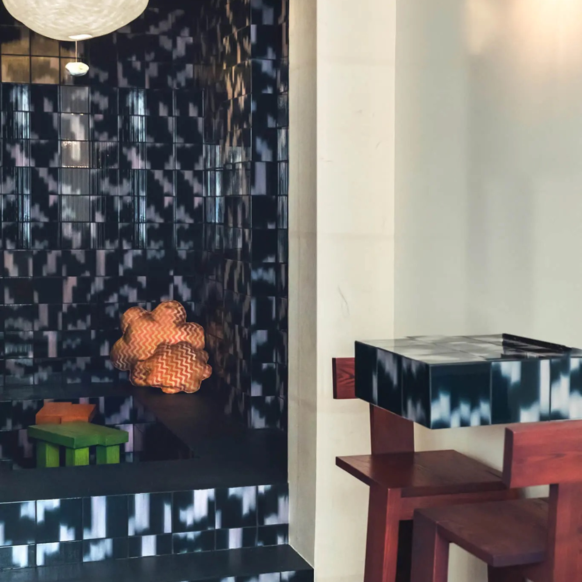
Palet extends this dialogue through customisable ceramic surfaces. Their tiles reject conformity in favour of softness and tactility, embracing subtle yet bespoke variation, gentle texture and rich mineral glazes. Installed across a kitchen, bathroom or fireplace, they become more than a finish; they become statement architecture. They invite tactility as much as visual admiration, reminding us that materials should be experienced as well as seen.
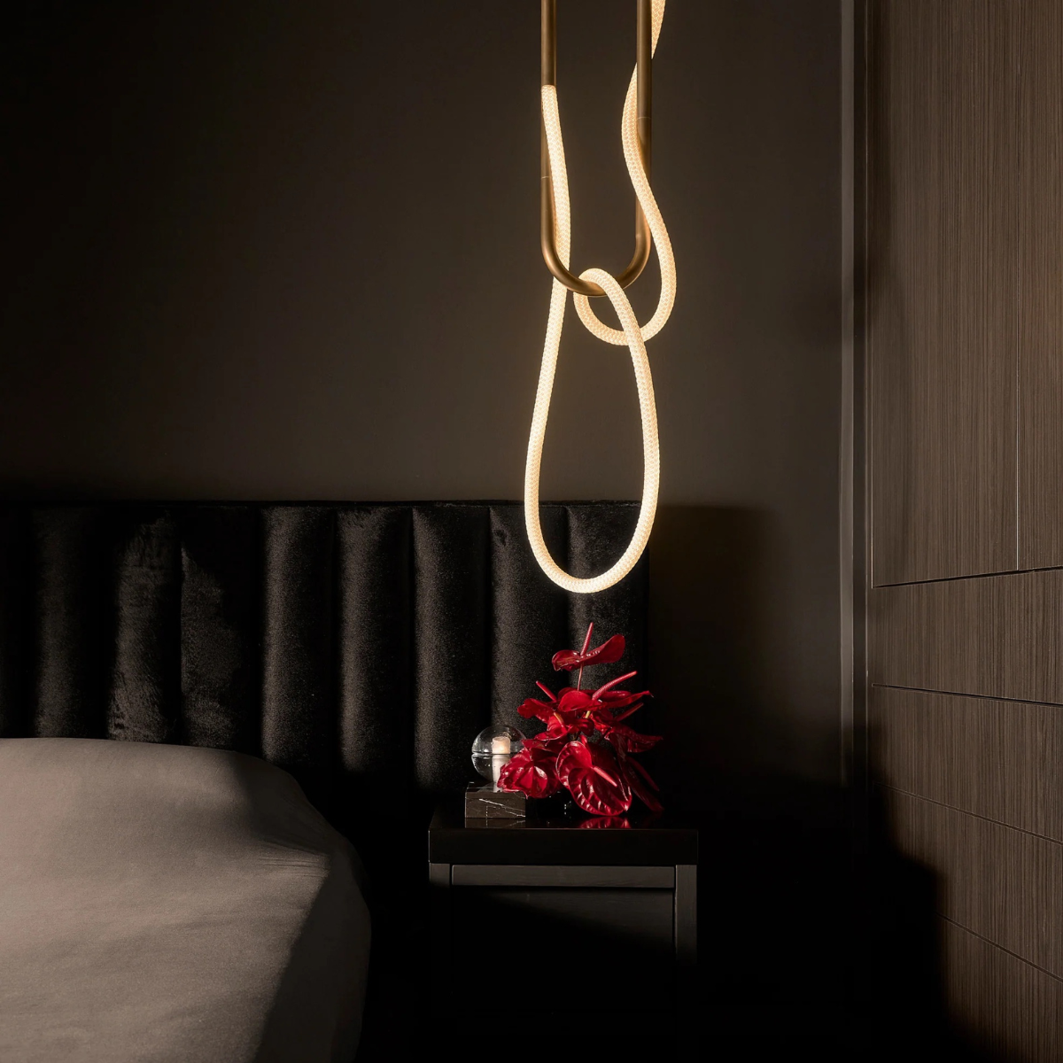
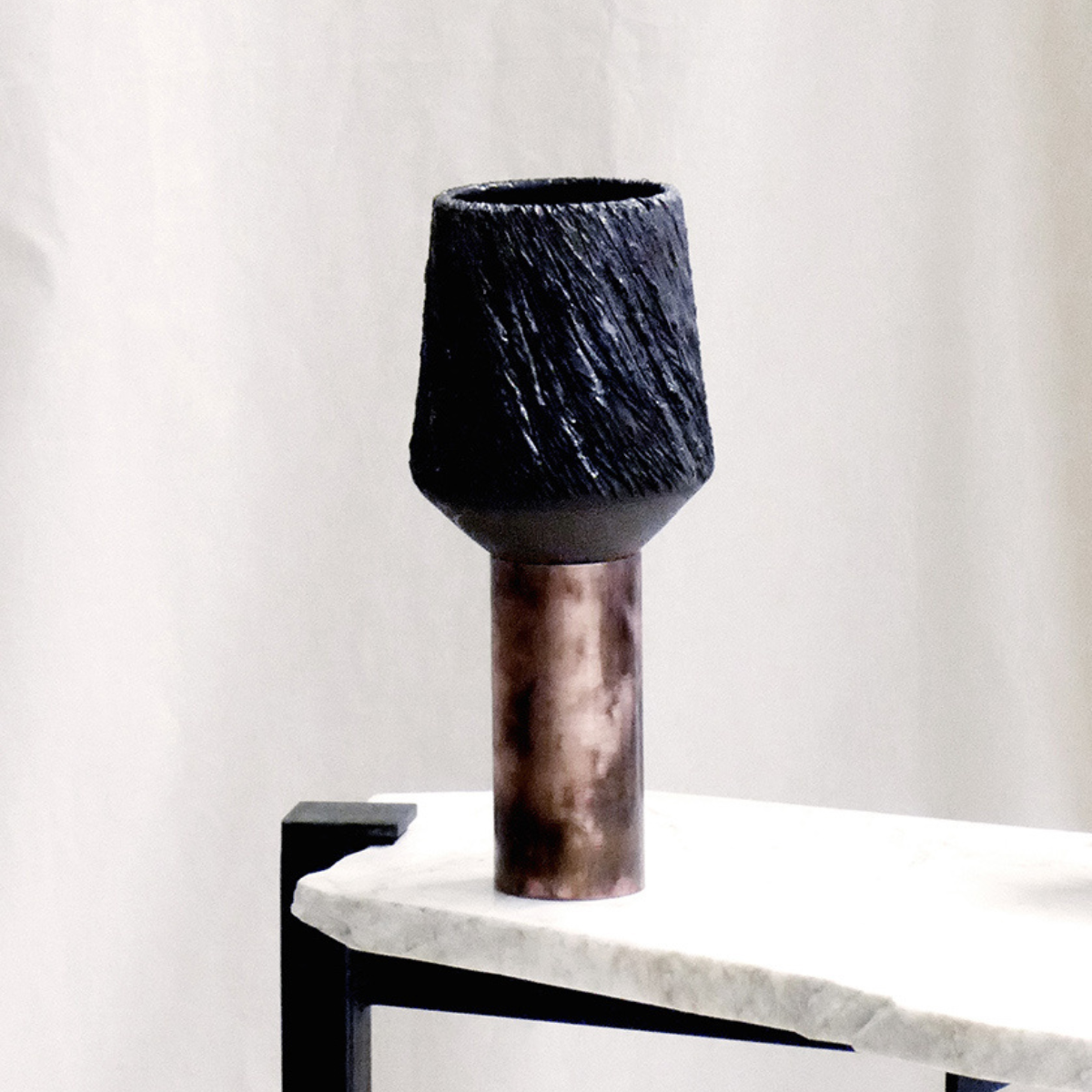
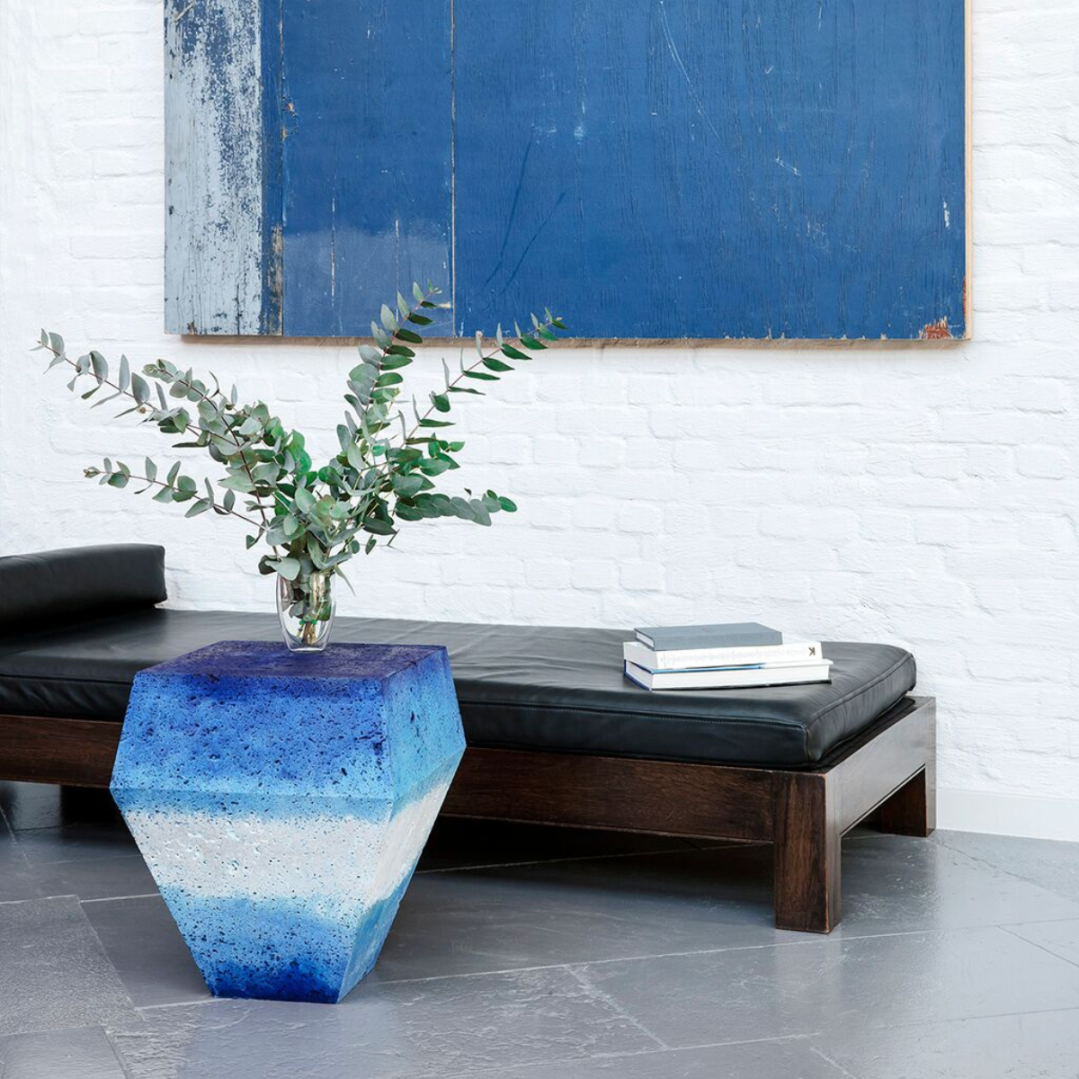
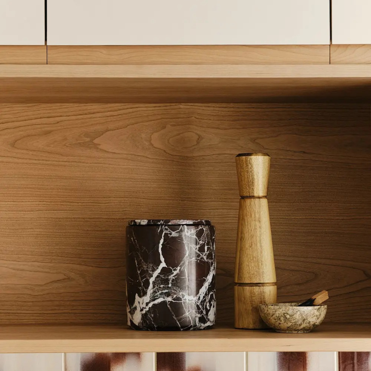
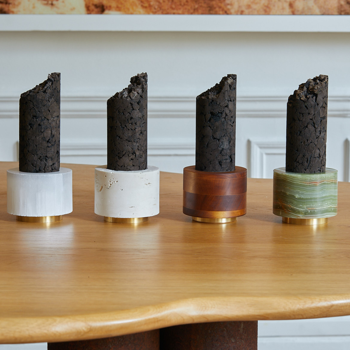
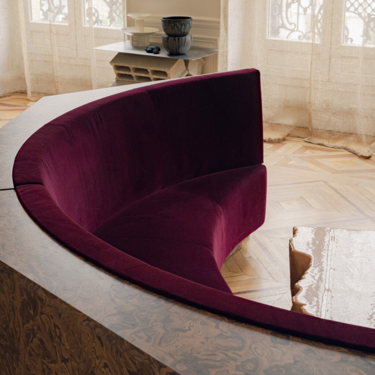
Then there is Sophie Dries, whose interiors exemplify a rare balance between sculptural expression and luxurious warmth. Stone, timber, bronze and ceramics coexist effortlessly, while furniture and objects are treated as multifunctional works of art rather than ornamental accessories. Her rooms never feel overdesigned. Instead, they suggest mindful spaces assembled over time through curiosity, craftsmanship and a deep appreciation for conceptual craftsmanship and individuality.
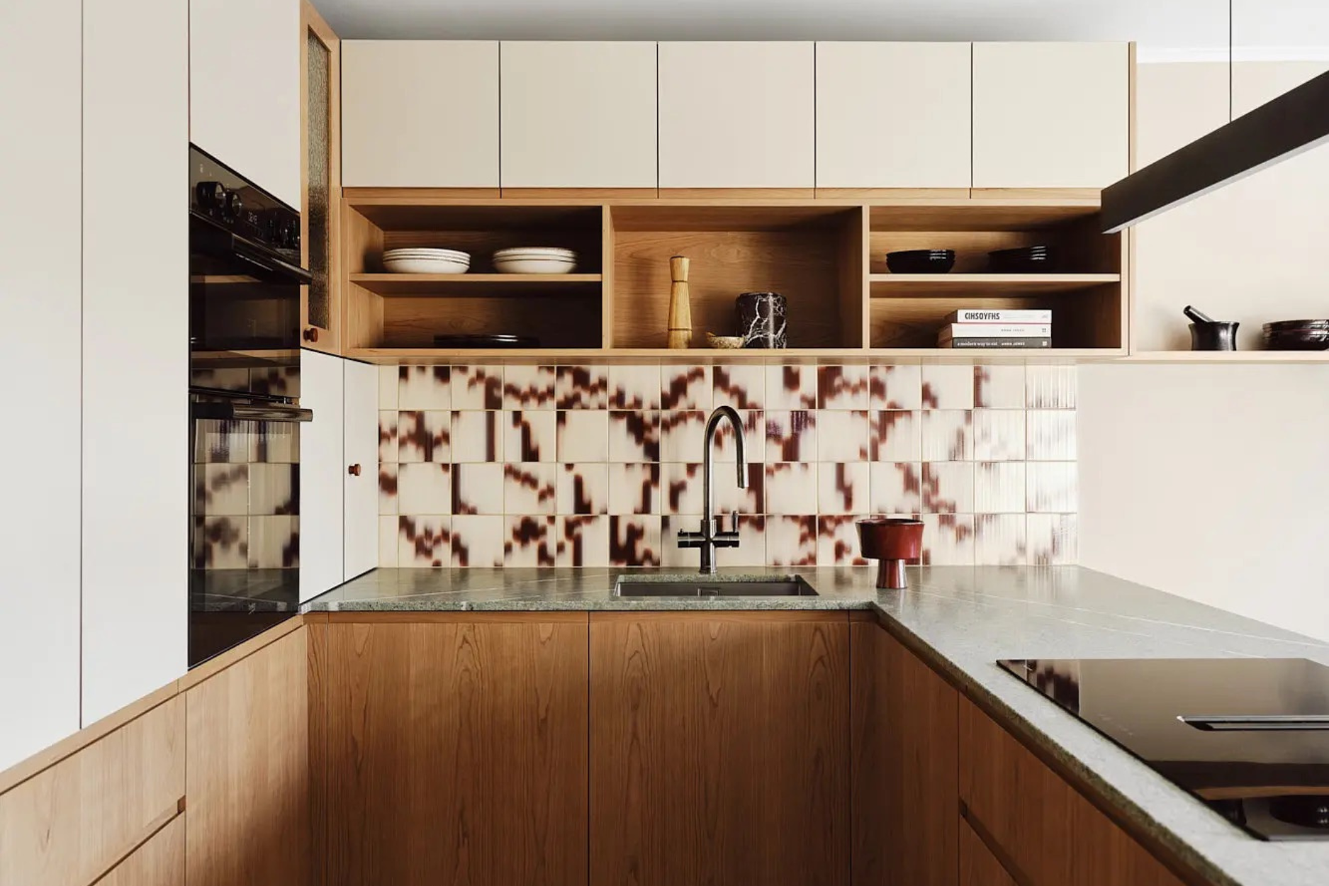
Together, these references articulate an approach to interiors that values composition over consumption. The room becomes a canvas where a single Tonester Viola oxblood wall balanced against pale limestone, or a handcrafted ceramic vessel placed on a quiet timber table. A room painted in a saturated olive becomes lighter when paired with natural linen, brushed oak and translucent glass. Rich materials gain presence when surrounded by negative space. The most compelling interiors understand this tension. They allow colour to breathe. They celebrate texture before pattern, silhouette before decoration and craftsmanship before excess.
Perhaps that is why these spaces feel so enduring. They are designed not for a photograph, but for daily life. Morning light catches a handmade glaze differently every day. A painted wall deepens as evening arrives. Objects collect memories alongside patina, becoming more meaningful through use. An exercise in balance: between colour and quiet, permanence and evolution, bold gestures and thoughtful restraint. Colour becomes emotion, texture becomes memory, and every carefully chosen object becomes a touchstone of a space that is lived in as thoughtfully as it is designed.
Tonester Website | Instagram // Palet Website | Instagram // Sophie Dries Website | Instagram